Configuring “drill to details” behavior in PowerPivot: Part 1

It has been said there is no way to change the default drill through behavior in PowerPivot.  However, if we look closely we discover that we can actually exercise a bit more flexibility than normally assumed when using this feature.

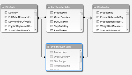
The first thing to understand is that drill through retrieves data from whichever table the measure has been assigned to.

This is an interesting feature – yet, not very intuitive –:  as it is possible to assign a DAX measure to any table in the model (even disconnected ones) without affecting the output of the measure at all, one can allocate measures to tables specifically designed for drill through.

Lets look at an example using Adventure Works.

image

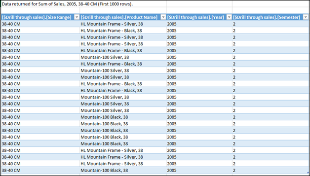
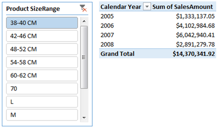
[Sum of SalesAmount] is an implicit measure.  As such, it was allocated to the table with numeric values (FactResellerSales). Notice this table is on the many-side of the context propagation.  When executing a drill through, we get an ‘exploded’ view of that table showing raw data:

image

Also notice that many technical columns are retrieved, which may not provide any value to the analyst (ResellerKey, for example) .  Instead, lets create a custom table to support a more customized drill through view, with only the columns we are interested in.  I will use the Table Import Wizard instead of writing straight SQL, as I believe this is something analysts will be able to configure on their own without the need to code:

image

By specifying the use of ‘Group and Aggregate’, we will get a list of the distinct product and order date keys in our fact table. As we might not interested in the original granularity as we are simply supporting a drill through action in order to show what dimension members make up a specific sales amount, a list of product and date members is sufficient in this case.

image

We can source the desired columns from the lookup tables by using RELATED. Or, to save memory space or for model usability, you may decide not to bring those columns on the visible lookup tables and only retrieved them from the source to populate the custom drill through table.

All columns should be hidden (do not hide the table, only the columns.  Hiding the table will hide the measure we will assign to it which is not what we want).

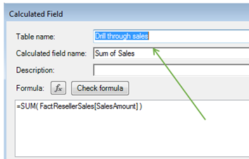
An explicit DAX measure is created at this point:

[Sum of Sales]:=SUM( FactResellerSales[SalesAmount] )

and assigned to the ‘drill through sales’ table:

image

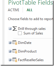
As only the measure is visible on this table, the pivot table field list will not show the regular table icon but one indicating the summation sign:

image

When clicking on the cell we clicked before, this time we get a more ‘customized’ drill through:

image
Note the keys connecting to the related tables are hidden, they are never retrieved on the drill through view.  This is good, as they are technical and not needed for analysis.

The order of the columns depends on the order in which you added the RELATED columns on your custom drill through table.  Simply moving the column to another position won’t change it on the drill through view.  To change order, it is necessary to re-create the order you wish to see.

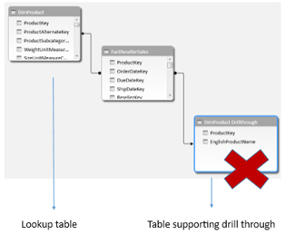
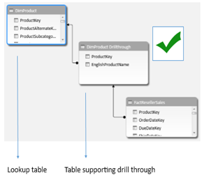
In order to custom drill through views to work, the default context propagation (from the one-side to the many-side) must be respected. As such, if you want to provide a small drill through experience from the visible lookup table you should snowflake the model instead of connecting both tables (visible lookup and custom drill through) to the fact table separately:

image      image

Note: in Excel 2013, there appears to be no way to change the default behavior of 1000 rows retrieved (this was not the case in Excel 2010).

Profiling data in PowerPivot: Detecting duplicates

Generally – when you are given an unexplored dataset – your first task should be to identify some of its properties in order to make a more informed decision regarding the accuracy of reporting you can achieve with it.  Many Business Intelligence professionals have robust tools at their disposal that can be used to deeply explore a dataset; however, data analysts can use the inherent capabilities of PowerPivot to get the job done.

One of the most common data profiling assessments is identifying duplicate values.  This is important as we want to decide on what sets of data can be good candidates for generating lookup tables in our model; And this is of particular relevancy when querying transactional sources that do not have clearly defined dimensions.

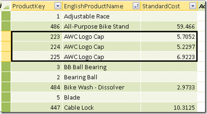
For example, say you want to load a product table into your model. In this case you are actually querying the enterprise data warehouse and the table you are using stores data for a slowly changing dimension of type II.  For this reason it can have legitimate reasons for having duplicate product names: it is storing the product attributes as they have changed over time:

image

Notice the highlighted product (AWC Logo Cap) has three entries on that table.  Over time, the product had different standard costs associated with it and the data warehousing team wanted to keep all history associated to past records.

If we intend, however, to mesh this data with another dataset that somebody sent to us (which did not come from the data warehouse and only has product name on it – not product key), we would want to know

a) are there duplicates on this table. We want to ensure this table can be used to generate a valid lookup table in the model, and PowerPivot requires unique values on the key columns of the lookup table when establishing relationships

b) If there are duplicate values, are they a data quality problem or based on legitimate reasons.

In our example, we know there are no data quality issues and we could easily generate a valid lookup out this table simply by going to the table import wizard and selecting the [EnglishProductName] field from while specifying a ‘Grouped by’ aggregation (using the same techniques detailed on this blog entry), or by issuing a T-SQL DISTINCT clause on the underlying query.

If the duplicates are based on data quality issues, we could instead ask the data source owner to fix them directly, even before it makes it to PowerPivot.

So now that we have determined that it is worthwhile identifying which records are duplicate, we need to know how to do this quickly using DAX.

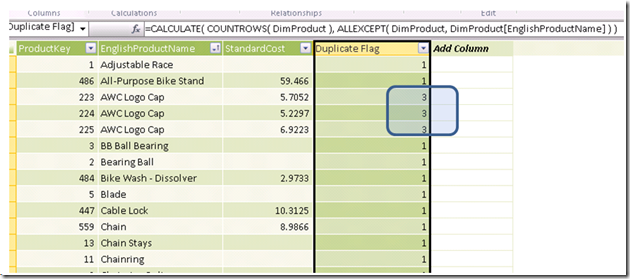
On the dataset above, this can be done using the following DAX calculation on a new column:

=CALCULATE( COUNTROWS( DimProduct ),

ALLEXCEPT( DimProduct, DimProduct[EnglishProductName] ) )

In other words, we want to count all rows on the table by establishing a filter context in which only the column we are testing is on it:

=CALCULATE( COUNTROWS( ‘Table’),

ALLEXCEPT( ‘Table’, ‘Table’[Column Tested for Duplicates] ) )

image

It is easy then to filter that column to only detect the products with more than one entry on that table. Notice how the column filter also quickly tells us there are products with 2 entries and others with 3 entries:

image

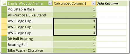
I used DAX’s ALLEXCEPT function, as we only wanted to test duplicates over one product attribute ([EnglishProductName]).  Had we been detecting for duplicates on a one-column table (one with only the column we are testing), we could have avoided this:

=CALCULATE( COUNTROWS( ‘DimProduct’ ) )

image

This is because on a one-column table, there is no need to exclude other attributes that can lead to duplicates.  On the other hand, when other columns exist, there is always the risk of having attributes with different values for the same dimension member (products, in this case).  An example would be the one mentioned above in which the product standard cost has changed over time.  As such, we must remove all those attributes from the filter context when we want to narrow our investigation to only duplicate names.

Once you have identified the problematic records, it will be easier to communicate an issue to the data source owner and more rapidly identify a course of action.  Even in the case you decide to use this table as a lookup in your data model, you will be now aware of potential future issues for which you can proactively plan for.

PowerPivot and Beyond: Expanding your analytical repertoire

One of those PowerPivot features that is no very well known is that PowerPivot can be used as a database that can serve many other tools besides Excel.   

I blogged about it a little bit here when I mentioned that PowerPivot can be consumed through other tools like Tableau.  However, I think is worth expanding on the topic a bit as this feature can be very useful for people migrating from “Personal BI” to “Team BI” or even “Corporate BI”.

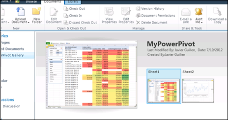
Imagine a scenario in which you have developed a PowerPivot workbook and have then published it to a PowerPivot Gallery in SharePoint.  Your report has now proven to be a success and its popularity has been rising recently across your company.   A business unit manager now wants to distribute this report to his team members, but filtering it to only the data that pertains to each of them.  The PowerPivot workbook has a big amount of data, demanding the 64-bit version on PowerPivot.  The manager as well as his team members cannot download the workbook and use it locally as they only have PowerPivot 32-bit version installed and due to corporate policies they do not expect to be upgraded soon.  

One option is for the manager to manually copy and paste the pivot table displayed on the browser into a separate excel file.  He would have to do this, every day, for each team member as he can only sent the portion of the data that belongs to that specific employee.  Not a great solution.

The other option would be to create a separate PowerPivot workbook for each of the team members with only his data.  Not a great solution either as the data model and DAX calculations would have to be replicated, and if you need to change one of them one day, you would have to remember to change it in each of the replicas.

What to do?  I want to point out that you can read a PowerPivot that has been published to SharePoint from a great number of other tools besides Excel. Some of these tools can enhance the PowerPivot implementation, giving us features to solve the scenario in question. 

For this example, let’s stick with Microsoft reporting tools.  Besides Excel itself, you can read PowerPivot data from Report Builder, SQL Server Reporting Services and PerformancePoint.  All of them have the capability to read from published PowerPivots.  SQL Server Reporting Services (SSRS), for example, will give you additional capabilities that will allow you to leverage your PowerPivot workbook but offer more advanced reporting layouts and delivery mechanisms, this last feature being what we need for our example.

When you read PowerPivot from another tool, you are not reading the pivot table in the workbook but the entire data model available in the PowerPivot window. This is true even for Excel itself, being a client to the PowerPivot database.

Lets continue with the scenario given.  This is how my PowerPivot looks like in SharePoint, once I have published it:

image

So far so good.  This is what most of the business users want to see and interact with.  

But other than the nice Silverlight interface, something else happens when the PowerPivot was published and someone interacted with it (via slicers or filters) or by scheduling an automatic data refresh:  a real database is generated in the form of a SQL Server Analysis Services BISM Tabular model.  You can verify this by opening up the dedicated SQL Server Analysis Services instance which the PowerPivot add-in for SharePoint uses (this is a requirement for the add-in to work).  In the case of my published report, I see the following through SQL Server Management Studio (SSMS):

image

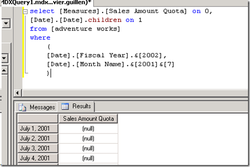
The highlighted database is quite literally my published workbook, in database form. If you happen to know some MDX you can then open a new query window and query the PowerPivot database (called a “model”) using this language.  Note that you can be querying, in MDX, a measure that was developed in DAX – like in the case below.  Additionally, you can create your own MDX calculated members as part of the query if necessary.

image

if you feel more familiar with DAX, though, you can query the PowerPivot model with it instead of MDX:

image

The point here is that PowerPivot is now stripped out of its Excel dependency and can be now queried from by many other tools (When SharePoint renders the workbook on the browser, it uses this SQL Server Analysis Services model with an Excel Services front end; however the Excel desktop application is not needed anymore).

  Going back to our scenario, we will be building a solution in SQL Server Reporting Services that will take a parameter and deliver a scheduled report based on filtered data coming from the PowerPivot model.

If you are not familiar with SQL Server Reporting Services (SSRS), I would recommend you start with Report Builder 3.0 which is a more data analyst centric version of the full blown SSRS product, yet it leverages the same underlying technology.

When connecting SSRS to PowerPivot, remember to always do it through the URL that hosts the workbook in SharePoint.  This is a very important point, as when you decide to enhance your PowerPivot workbook and republish it, a new cache copy will be created in SQL Server Analysis Services.  By using the URL instead of a direct connection to the model, you will be certain to always consume the ‘latest & greatest’ version of the workbook.

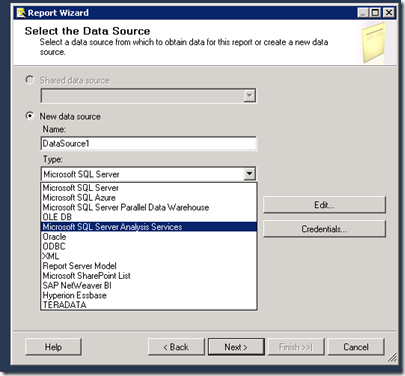
In Visual Studio 2010, you can create a new SSRS data source by selecting the Analysis Services provider:
image

Click on Edit and use the SharePoint location of the PowerPivot workbook to select the Model:

image

With the connection to PowerPivot now created, you can use the MDX query editor to drag and drop the elements needed for the report.  In this case, I have created a parameter based on employee email, as I will be using this for generating a filtered version of the report for each employee I am interested on:

image

Below is how the final PowerPivot-connected SSRS report looks like.  The currency amounts shown are associated only to the employee in question (filtered by his email account, selected with the dropdown at the top of the report):

image 

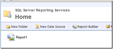
We can now deploy the report to the report server:
image

In order to schedule an automated run that goes a number of email values and delivers the report with filtered data we must configure an SSRS snapshot.  Notice that by doing so we are now using capabilities beyond those of a pure PowerPivot implementation.

There are many websites that explain the process of generating an SSRS subscription so I won’t go into a lot detail here, but I was want to show how the process would look like in general terms.

What we want to do at this point is select the report and click on ‘Manage’.  That will give you access to a set of features built into the SSRS framework. 

image

First, select ‘data sources’.  On it, be sure to specify the account that will be used to query the PowerPivot model:

image

After that, click on ‘Subscriptions’ and then on ‘New Data Driven Subscription’.  Following that, give your new subscription a name and specify a data source that contains recipient information.  This data source does *not* need to be in PowerPivot, it can be a table in a SQL Server database that specifies the information about where and how to deliver the automatic snapshot.

In my case, I decided for the creation of a file on a network share instead of email delivery.  As such, the query specified next in the wizard should contain that information, as well as specifying how the report parameter (employee email address) should be set on each iteration of the snapshot:

image

Here is how my SSRS_Subscription table looks like:

image

In other words, I want to create two files:  One called ‘JavierSnapshot’ which was the report filtered for the email address amy0@adventure-works.com  and another one called ‘LeeSnapshot’ which should filter the report for garrett1@adventure-works.com.  These are just examples, in your case you may want to use specific output files mapping, for example, sales manager with sales territories.

The SSRS subscription wizard now instructs us to map the output of the table with the chosen delivery attributes (file delivery in this case), as well as mapping output columns with report parameters:

image

At the end, the wizard asks you for the schedule on which you want this process to execute. 

Here is what the output looks like, in my case, after the subscription has automatically executed:

image

In summary, each PDF was generated by the SSRS report querying the PowerPivot model, but only filtering for a specific employee and automatically delivering the output to a folder in the network.  Pretty useful functionality that can enhance the options available to your self-service environment.
Creating lookup tables in PowerPivot using SQL queries

On the last post I showed how to model for a scenario in which two datasets must be merged.  A custom lookup table was created using the ‘remove duplicates’ functionality in Excel.  In this post I will walk through the same scenario, but this time using the SQL query wizard in PowerPivot to achieve the same result.  This post is intended for power users who will benefit from creating robust PowerPivot data models.

First of all, lets clarify why this is useful: in order to create a robust PowerPivot report, it is sometimes necessary to create lookup tables to allow PowerPivot relationship rules to work seamlessly (as noted on this post).   In some cases you may want to prototype this manually (as described on my prior post).  However, once you have a final model you want to re-use, you may want to consider using SQL queries instead of manually removing duplicates, in order to benefit from a fully dynamic PowerPivot model that automatically updates lookup tables upon refresh.

SQL query example

I have used the same extract table samples as in the last post.  In this scenario, we don’t want to generate a lookup ‘reference’ table manually, but instead relay on the underlying relational data source.

The modeling solution discussed on the last post is still valid as well: we must create two new lookup tables:  Products and Dates.

Lets start with Products.   Suppose I have already loaded both datasets from a SQL Server source. By clicking the ‘reuse existing connections’ option in the ribbon under the ‘design’ tab, we can re-connect to the source and use PowerPivot ‘Table Import Wizard’ to create the lookup table.   Instead of selecting from a list of tables, I can use the option ‘Write a query that will specify the data to import.’ Even though I am telling PowerPivot I will write a query, there will be no need to write code at all.

Select the ‘design’ button:

image

At this point the SQL wizard opens.  Here are the steps:

1.  Select the Product ID field from Table 1 and the Category from Table 2:

image

2. Click on the ‘Group and Aggregate’ button on the top right corner

image

3. Expand the relationships tab

image

4. Deselect “Auto Detect” on that same tab.  Click on the ‘add relationship’ button:

image

5. Click on the Left Table, specify Table 1.  Then click on the Right Table and specify Table 2.  Change the join type to ‘Full Outer’ (this is needed when creating lookups that span across multiple tables on the same underlying data source. Here is a good explanation of what joins do). 

Finally, select the Join Fields by double clicking on the field and selecting Product ID (on Table 1) equals to Product ID (on Table 2).  Here is how the window should look like:

image

What we have done is select all the Product IDs from Table 1 (as that table contained a comprehensive list of products), and all the Categories from Table 2 (as there were no category columns on the first table).  The ‘grouped by’ option is needed to generate a distinct list of product/category combinations (remove duplicates), and the join was necessary to grab data from both tables.

Once finished, clicking will show you the query PowerPivot has written for you.  At this point, you can rename it so it will have a more user friendly name in your data model:

image

At this point, I can now join the two initial datasets with this lookup table:

image

Again, it was necessary to do this in order to allow filtering of both initial datasets by a common category.  Without this lookup table, it would not be possible (or really difficult) to report on both sets of data in a consolidated view.

Now lets go for the Dates lookup table.  In this case there is an small extra challenge: neither table has the complete list of dates.  So after we configure the wizard using the same technique above, we get the following:

image

which results on this in-memory table:

image

With DAX, we can easily overcome this.  By creating a new calculated column, we can now have the complete list of unique days in only one place:

=IF([Table_1 Date] = BLANK(), [Table_2 Date], [Table_1 Date])

image

Further calculated columns can add more calendar levels for analysis, like month, quarter, year and so on.

image

The data model (in the PowerPivot design window) now should look like this (once the relationships have been created):

image

To be able to slice “Total Sales Amount” by Product or Date, we only need to do one extra step – create a DAX measure to add the Amounts from both extracts (Table_1 and Table_2, just was we did in the last blog post):

clip_image012_thumb1

With this, you can now slice the consolidated amount (from both extracts) by any relevant Product or Date category with the added advantage that PowerPivot will update the lookup tables once a data refresh has been executed.  In the end, not only the DAX calculations will be dynamic (based on query and filter context), but the data model will by dynamic based on the newly imported data.

Merging data in PowerPivot

Update 9/23/13:  Check an example using Power Query to deal with the same issue described on this article: https://javierguillen.wordpress.com/2013/09/23/target-well-formed-data-models-when-using-power-query/

One of the most common requests I have seen from data analysts working with PowerPivot is how to merge two or more datasets. For example, you are given the following two sales extracts and are asked then to generate a YTD report based on their composite data

Extract 1 (Table 1):

image

Extract 2 data (Table 2):

image

If we want to report on total amount for the year, we must combine these two files. How do we do this?

Somebody new to PowerPivot may be tempted to add a relationship between those two tables on the common key column (Product ID). However, when attempting this, PowerPivot will return an error:

image

PowerPivot complains that there are duplicate values, which indeed there are (on both tables, Product ID has multiple values that are the same). Here is one clue: if you examine the relationship window closely you will notice that one table is a ‘lookup’ whereas the other one is not:

image

For this lookup table, we want unique values, as there is no point on having a lookup table that would resolve in more than one value. Why is that? Imagine you have the following tables:

image

Notice how there was a sales amount for 1/1/2012 for the city of Bogota. If we wanted to report on the sales figures by Country, which country should we use from the look up table? (there are two different matches for the same city name so PowerPivot couldn’t logically resolve this relationship).

So the rule for PowerPivot lookup tables is that the field in which we join must have unique values (no duplicates allowed).

Let’s go back to our example. How are we going to merge the tables if we have no valid ‘lookup’? Here is where the world of ‘self-service BI’ comes to life: if we don’t have the table we need, we can create our own!  This effort is what is referred to as data modeling, as you are organizing the structure of the data as it resides inside PowerPivot.

I will walk through the example in two different scenarios, fixing the data right in the spreadsheet or relying on an underlying relational database (you can find the database  scenario on the following blog entry available here).

Worksheet only example

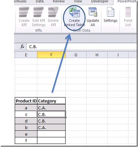
Ever wonder if there was a way to give Excel a list of values containing duplicates and have it remove those annoying ‘dups’ automatically? Well, such a button exists in the Excel ribbon indeed and is called – not mysteriously – ‘Remove duplicates’:

image

Let’s use it to create our lookup. As we want to join by Product ID, our lookup will be a Product table. Notice also we have Product Categories in one of the tables, and it is always a good practice to encapsulate all related attributes in one logical grouping, hence those category names should go into this new table as well.

Copy and paste the Product ID and Category from ‘Table 2’ somewhere into the worksheet (including headers). Then copy and paste the Product ID values from ‘Table 1’ below the last value. Now, highlight the values and click on the ‘remove duplicates’ option in the ribbon. Select only the ‘Product ID’ column:

clip_image006

You can now import the resulting table into the PowerPivot model:

image

For usability, I created a calculated column that shows the value “uncategorized” whenever the product didn’t belong to a category, and then I hid the imported ‘Category’ column:

clip_image008

Now we can join both initial tables to our custom lookup and PowerPivot will be happy. If you notice, we have gotten closer to the creation of a star schema. This is interesting to notice, as advanced data analysts will quite literally engage in testing data models as they produce reports — data models than I.T. can then qualify for upgrade to full blown SSAS BISM Tabular models (with the added advantage that they will be already ‘tested’ by subject matter experts).

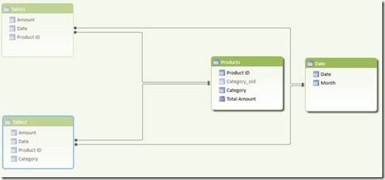
Anyhow, here is how our new data model looks like in the PowerPivot design window:

clip_image010

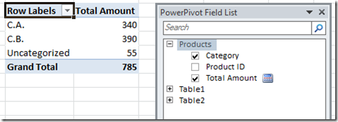
We can now test our data model in a pivot table:

clip_image011

Notice we still have two ‘Amount’ fields. We must consolidate them into one. That is pretty simple to do, by creating a new DAX measure:

clip_image012

Now we can remove the other two measures and leave only this [Total Amount] measure. The resulting pivot table will have successfully merged the amounts from the two monthly extracts:

clip_image013

We can now execute the same logic and create a second lookup table that will allow us to slice by date or month. Following the same technique, we arrive at this data model:

clip_image015

I added a DAX calculated column to the new lookup which shows the month name for each date and hid the initial extract tables in order to ‘clean’ the data model and increase usability. We can now slice both tables easily and create an interesting report:

clip_image016

I added a DAX year to date measure:

YTD:=TOTALYTD( [Total Amount], ‘Date'[Date] )

plus a pivot table and a pivot chart. With this, it is now easy to see:

*  the best performer (category “C.A.” on Jan),

*  the worst (non-categorized products on Feb) and

*  category “C.B.” is growing at a pace that is outperforming the others.

Very powerful analysis is easy to achieve when understanding the rules under which the PowerPivot engine operates!

Enabling Tableau to read PowerPivot model updates

One of those interesting opportunities that opens up when using PowerPivot in conjunction with SharePoint 2010 is that of leveraging the PowerPivot cube-like interface of its inherent data model in order to extend the analytical arsenal of an organization.

Tableau is a great tool that can extend the reach of PowerPivot deployments due to its advanced visualization capabilities.

Its typical for data analysts to go over many iterations of a PowerPivot report (model) before they consider it good enough to share it with others.  At this point, though, Tableau 7.0 does not by default grab the latest and greatest version of the PowerPivot analytical database, the one with the must current data model and DAX calculations.

Lets walk through a typical scenario.  A data analyst creates a PowerPivot report and publishes it to SharePoint. He then wants to create additional visual analysis using Tableau against the data model that was loaded into PowerPivot.

A typical PowerPivot report URL location would look like this:

http://myServer/PowerPivot Gallery/MyPowerPivot.xlsx

image

In Tableau, he can then use this URL to connect to the cube-like interface of the underlying PowerPivot data model.  To do this, he uses the Microsoft Analysis Server option, and instead of typing a server name simply he uses the URL location of the PowerPivot workbook:

image

To be clear, you are not connecting to the Excel pivot table, but to the underlying PowerPivot model.  This normally contains more data and metadata than the actual Excel report rendered in the PowerPivot gallery.  At this point, he is able to create interesting Tableau analytics using PowerPivot as the source:

image

Now he wants to add additional DAX measures to extend the analysis. He adds the following expression to PowerPivot:

% of Total Sales:=[Sum of SalesAmount] /

CALCULATE([Sum of SalesAmount], ALL(DimSalesTerritory) )

And republishes to SharePoint.  By interacting with the newly published PowerPivot report by either selecting a new filter, invoking the workbook through a client via the SharePoint URL or simply by scheduling a data refresh, an updated version of the PowerPivot underlying model is stored in the dedicated instance of Analysis Services that SharePoint uses.

At this point, If you imagine being the data analyst in question, you may now attempt to re-open the Tableau workbook but you will get an error message:

image

And the report is wiped out.  Hmm not good!   Interestingly, other clients like SSRS, Report Builder and Excel can get the latest version of the PowerPivot model without an issue.  So how can we enable Tableau to leverage the PowerPivot model changes seamlessly?

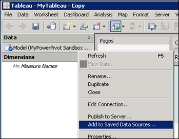
The solution is fairly simple, though not very intuitive.  Prior to doing any changes to the PowerPivot model, we must save the Tableau connection:

image

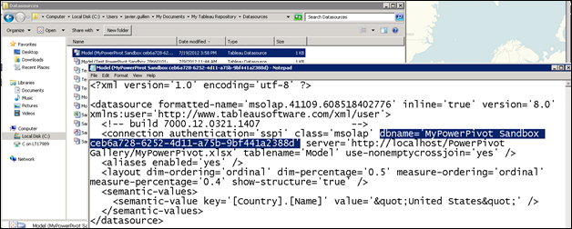
This process creates an actual file that we can then edit in notepad.  We must remove the database name from the connection file (highlighted below) and re-save:

image

This is necessary as Tableau is creating a connection to a specific version of the PowerPivot model which is not valid anymore.  By removing the database name, SharePoint is able to point Tableau to the newest PowerPivot model available, which will then enable the report to work without errors and with all the changes to the underlying model.  After implementing the solution, the data analyst can now use this saved connection to create Tableau workbooks that will automatically update the metadata to match that one of the newest PowerPivot model.

image

In the scenario discussed, he would see the new DAX measure in the Tableau measures pane and use it as part of the visualization:

image

It is possible to save these connection files to Tableau server and share them with others, so newly created views will benefit from automatic synching with the most updated PowerPivot hosted models.

image

Keep in mind that one of the great benefits of connecting to PowerPivot workbooks hosted in SharePoint is that you get additional features like automatic data refresh and security, along with the ability to centralize one model that can serve many reports across multiple platforms and tools.

In my opinion, this technique allows data analysis to benefit from the best of both worlds when conducting rapid iteration self-service BI.

LastNonEmpty in Tabular mode: Part 2, Last Ever Non Empty in DAX

One of the most useful inventory calculations is what Chris Webb referred to as ‘Last Ever Non Empty’.  This calculation differs from the regular MDX Last Non Empty aggregation in that it will yield, for each dimension member at the granularity specified, the fact value on the last date for which there was data even if that date happened before the selected time frame.

image

Jason Thomas (blog | twitter) and I have recently been working on classifying a number of different types of Last Non Empty scenarios that people may encounter when working on inventory control analytics.  Though the examples we use are for inventory reporting, these patterns are clearly applicable to reports beyond this subject area and can be applied anywhere there is a need for Last Non Empty aggregations.

We have come up with the following categorizations:

image

This is part 2 of this series, in which I will explain in more detail a DAX pattern to tackle Last Ever Non Empty scenarios in BISM Tabular.  This is one type of aggregation that is not easy to handle in Multidimensional, so its worth exploring if we are able to achieve a better performing calculation with DAX. If you are interested in the first two Last Non Empty scenarios, please refer to part I of the series available here.

Handling these calculations require leveraging another DAX pattern which we blogged about before, one that allows us to explicitly execute a Tabular calculation at an explicit level of granularity.  These articles can be found here and here.

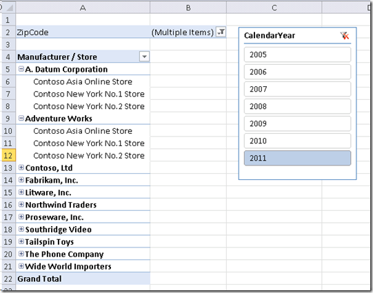
Lets approach the first scenario of Last Ever Non Empty calculations.  In order to explain this better, lets use an example from Contoso’s database.  Suppose we want to find out what the last amount of inventory in stock across all stores is.  In this case, we want to analyze stores by grouping them by the product manufacturers we distribute. In other words, we want to find out what the last date with inventory data was for each manufacturer, and then add the inventory quantity in stock on that day across all stores that distribute products from the manufacturer in question. In order to compute this, we can start with a simple pivot table like the following:

image

I have selected only a few zip codes (10018 and 10093) to narrow the analysis.   We first want to identify what the latest date (with data) was for each manufacturer.  Using just a CALCULATE function coupled with LASTDATE won’t do the trick.  For example, the following expression will return the last date of the date dimension:

Measure 1:=CALCULATE( VALUES( DimDate[Datekey] ) , LASTDATE( DimDate[Datekey] ) )

image


If we tried using the date on the fact table instead, we would still get incorrect results as the last date with activity for those stores happened before the selected year of 2011:

Measure 1:=CALCULATE( VALUES( FactInventory[Datekey] ) , LASTDATE( FactInventory[Datekey] ) )

image

Instead, what we want is to iterate though each store (in effect, changing the granularity of the calculation) and retrieve the last date with activity which is less than or equal the year we selected. In order to do this, we must define an iterator (MAXX, for example) and then use CALCULATE to retrieve the last day with fact data.  The calculation for this is:

LastEverNonEmptyDate:=IF(HASONEVALUE(DimStore[StoreName]) , MAXX(
        SUMMARIZE
        (
        DimStore,
        DimStore[StoreName]
        ,"LastEverNonEmptyDate", CALCULATE( MAX( FactInventory[DateKey] )
                                , DimDate[CalendarYear] <= VALUES( DimDate[CalendarYear])
        ) )
    , [LastEverNonEmptyDate] ) )

In reality, the use of MAXX is not because we want the MAX value, but because we want to iterate through the in-memory table defined by the SUMMARIZE function.   If we used MINXX instead of MAXX, we would still get the same output:

image

With this information, we can now tackle scenario # 1 of the Last Ever Non Empty pattern.   We want to get the value for each manufacturer on the last date in which it had activity (last non empty date across all stores).  By changing the grain of the calculation to iterate over manufacturers instead of stores, we can get that date and retrieve the quantity of inventory in stock on that date:

LastEverNonEmpty-AllStores:=SUMX(
    ADDCOLUMNS(
        ADDCOLUMNS(
        VALUES(DimProduct[Manufacturer])
            ,"LastEverNonEmptyDate",
                CALCULATE( MAX( FactInventory[DateKey] )
                , DimDate[CalendarYear] <= VALUES( DimDate[CalendarYear])
                )
            )
        , "Quantity", CALCULATE ( SUM( FactInventory[OnHandQuantity] )
                        , FILTER(ALL(Dimdate), DimDate[DateKey] = [LastEverNonEmptyDate] ) )
        )
    , [Quantity] )

The inner ADDCOLUMNS function is used to retrieve the last ever non empty date for each manufacturer (up until the selected year).  The outer ADDCOLUMNS function allows us to use this date and dynamically filter the fact table as we iterate across all manufacturers.   In the pivot table, at the store level, we are still able to see what the value was for that store on the last ever non empty date.   However, notice that at the manufacturer total level, only the stores with activity on the last ever non empty date (for the current store) will be aggregated:

image

This calculation performs rather well, and in a fact table of a little more than 8 million rows it is able to generate an output in approximately 2 seconds.

Finally, we want to tackle the more complex scenario in Last Ever Non Empty patterns.  This one requires that the manufacturer total takes into account the last ever non empty value for each store.  In other words, in the example above, the total should take all rows into account, not just those for 12/26/2009.  In DAX, we are able to change the granularity of the calculation to now be a composite of manufacturer and store.   The final expression is:

LastEverNonEmpty-EachStore:=SUMX(
    ADDCOLUMNS(       
        ADDCOLUMNS(   
            CROSSJOIN(
                VALUES(DimStore[StoreName]),
                VALUES(DimProduct[Manufacturer])
            )
    ,"LastEverNonEmptyDate", CALCULATE( MAX( FactInventory[DateKey] )
                                        , DimDate[CalendarYear] <= VALUES( DimDate[CalendarYear]) )
        )   
    , "Quantity", CALCULATE ( SUM( FactInventory[OnHandQuantity] )
                        , FILTER(ALL(Dimdate), DimDate[DateKey] = [LastEverNonEmptyDate] ) )
    )
, [Quantity] )

Here, we are using a nested expression to calculate, first, the crossjoin of store names and manufacturers.  Then, we get the last ever non empty date for each combination.  Finally we get the total quantity for each pair, as we iterate over that table using SUMX.  The result is correct, even at the grand total level and even thought the computation is more complex it executes again in about 2 seconds in the Contoso 8 million row fact table; in other words, I couldn’t identify – during my tests – any performance overhead compared to the prior calculation.  Getting this kind of performance on a last ever non empty calculation in Multidimensional is hard or even impossible to achieve, and it would require tweaks to the ETL which are not always ideal.

image

Notice how the highlighted row is now included on the manufacturer total.   Explicitly specifying the grain of the DAX calculation to use both, manufacturer and store, is necessary to iterate properly at the grand total level as many stores can be classified under multiple manufacturers and simply getting the last ever non empty date at the store level will incorrectly represent the amounts as the context of the calculation would only use the last ever non empty date of each store across all manufacturers which is clearly incorrect.

Also note that when leveraging the iteration used in the expression, we are looping over the values on the lookup table and not the base table.  This is an important point as the date lookup is filtering the fact table, but the product and store lookup tables are not filtered as context is unable to propagate to them by default.  In this way, we are able to grab stores that had activity even before the selected calendar value (a year, in this case).

These examples show the versatility of Tabular and the DAX language.  By respecting the rules of context propagation, we can develop advanced calculations that are not built into  the model.

SCOPING at different granularities in DAX (Part III)

In the last two blog entries on this topic (available here and here), we got a bit closer to reproducing – in DAX – the same output one would normally achieve with the MDX scope statement.

In this new entry, we perfect the formula a bit more by ensuring filter context propagates to the higher levels of granularity we are affecting.  Thanks to Gerhard Brueckl ( blog ) and Jason Thomas ( twitter | blog ), who contributed greatly to this blog entry and helped point out areas of improvement.

With the last formula we used, we are able to retain the Fiscal Quarter context (and split its value evenly among the months that belong to it), even if fiscal quarter is not part of the query context.

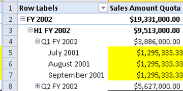
There is one issue with the formula, though:  if a user modifies the query context to include only two months for example, each belonging to a different quarter, the total for the year would be incorrect.  Let’s take a look:

image

If we manually add the quarter totals we can see the fiscal year value is off.   What is happening here?  We must realize that we are ‘scoping’ at the month level: through the use of

SUMX ( VALUES ( <month> ), <expression invoking fiscal quarter> )

we are:

  1. iterating over a list of monthly values and
  2. making a reference to the quarter(s) at the current filter context

With this understanding we can now see how at the Fiscal Year level the context will contain two quarters.  As such, each iterated month will be accounted twice.   The solution is a VERY simple one, yet not immediately intuitive:   We must wrap our CALCULATE expression with another CALCULATE.  In this way, the ‘current month’ in context will only refer to the actual fiscal quarter that contains it – avoiding ‘double counting’ of data.

Here is the final expression:

Scoping v3 (SUMX):=SUMX(
    VALUES( DimTime[EnglishMonthName] ),
    CALCULATE( CALCULATE( SUM( FactSalesQuota[SalesAmountQuota] ) ,
            ALL(DimTime[EnglishMonthName]),
            SUMMARIZE(DimTime, DimTime[FQ] )
        )
    /
            CALCULATE( DISTINCTCOUNT( DimTime[EnglishMonthName] )  ,
                ALL(DimTime[EnglishMonthName]),
                SUMMARIZE(DimTime, DimTime[FQ] )
            )
) )

Notice the double CALCULATE on the third line.  We are:

1) computing an expression based on modified filters (the first CALCULATE) and then…

2)  converting row context into filter context so each Month gets assigned the appropriate value (the second CALCULATE).

image

Whenever you are “scoping” at a specific level in DAX, you must use a double CALCULATE pattern in order to propagate context appropriately at levels higher than the one you are currently affecting.

With this change, context now gets properly established at the year and grand total levels:

image

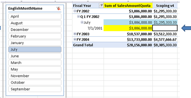
Finally we must consider not only the levels above month (quarter, year), but also the levels below (day).   As shown in the first part of this blog series, the SSAS cube dimension usage is assigned, in Adventure Works’ Sales Targets measure group, at the quarter level of granularity.  This in effect leaves date level members with no sales target values (even though the actual relationship happens at the daily grain in the DSV):

image

We can modify the DAX calculation to mimic the same behavior.  Instead of modifying the Tabular model itself, we can simply add a condition to our calculation so it will only execute at monthly levels and above, but never at the daily level:

Scoping v4:=SUMX(

    VALUES( DimTime[EnglishMonthName] ),

    CALCULATE(IF(NOT(HASONEVALUE(DimTime[FullDateAlternateKey])) ,

            CALCULATE(

                SUM( FactSalesQuota[SalesAmountQuota]) ,

                SUMMARIZE(DimTime, DimTime[FQ] ) ,

                ALL(DimTime ) /

            CALCULATE( DISTINCTCOUNT( DimTime[EnglishMonthName] )  ,                

                SUMMARIZE(DimTime, DimTime[FQ] ),

                ALL(DimTime)

                )            

            ) ) )


Notice the only change in the calculation is the IF statement on the third line.  With it, we now are able to fully match MDX behavior at any level of a Calendar hierarchy.  If you are in need to compute a DAX expression at a specific level of granularity on your Tabular model, consider using a similar pattern as the one exposed above.

image

Finally, if we want to simplify this pattern we can replace the outer CALCULATE with SUMMARIZE.   As both of them have the ability to turn row context into filter context – which is needed to accurately compute at all levels – we can use it to generate a more readable version of the calculation – Thanks Gerhard for the suggestion!

SUMX(

SUMMARIZE(DimTime, DimTime[EnglishMonthName], "CalculatedMonthValue",

IF(    NOT(HASONEVALUE(DimTime[FullDateAlternateKey] ) ),

CALCULATE(

        SUM(FactSalesQuota[SalesAmountQuota])/DISTINCTCOUNT(DimTime[EnglishMonthName]),

        VALUES(DimTime[FQ]),

        ALL(DimTime))) ),

[CalculatedMonthValue]
)

SCOPING at different granularities in DAX (Part II)

As mentioned on the prior post on the topic (available here), the DAX calculation that mimics MDX scope behavior requires a certain ‘filter arrangement’ to work properly.  In other words, it actually expects a display hierarchy -  otherwise it will not yield the correct results. Can we overcome this to more closely resemble MDX behavior? Interestingly, yes – is it possible, using a variation of the formula exposed on the prior entry.

image

Let’s examine this issue a bit closer:  Continuing with the MDX scope Adventure Works example which was used in the last blog entry, I am able to query the month directly and still get the assigned cell values even if the quarter is not part of the query expression:

image

With the DAX solution we used, however, we are unable to get the same results as we expect to Fiscal Quarter to be part of the current query context. Lets first remember the correct output.  Notice we are using a fiscal hierarchy of year, quarter and month:

image

As you may recall, the calculation limits itself to clearing the filter context on month (highlighted below), which forces the engine to use the next display hierarchy level available to allocate the calculation context. This happens to be quarter in our example. Once we grab that value, we split it by the number of months belonging to that quarter:

SUMX(
    VALUES(DimTime[EnglishMonthName]),
    CALCULATE(
        SUM( FactSalesQuota[SalesAmountQuota]  ) / CALCULATE( COUNTROWS( VALUES( DimTime[EnglishMonthName] ) ), ALL( DimTime[EnglishMonthName] ) ), 
      
ALL( DimTime[EnglishMonthName] )
    )
)

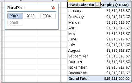
If we remove the quarter from the query context, we get:

image

Clearly not matching MDX results. So how can we truly assign a value derived from a quarter level assignment to the monthly level, regardless if quarter is in the resultset or not? One way of doing this is by leveraging the SUMMARIZE function.  With it, we can build a table on-the-fly at the appropriate level required and use it as a ‘set filter’ parameter to the CALCULATE function:

Scoping v2(SUMX):=SUMX(

    VALUES( DimTime[EnglishMonthName] ),

        CALCULATE( SUM( FactSalesQuota[SalesAmountQuota] ) ,

            ALL(DimTime),

            SUMMARIZE(DimTime, DimTime[FQ] )

        )

    /

        CALCULATE( DISTINCTCOUNT( DimTime[EnglishMonthName] )  ,

            ALL(DimTime),

            SUMMARIZE(DimTime, DimTime[FQ] )

        )

)

Notice that Fiscal Quarter ([FQ]) is called within the SUMMARIZE function.  As such, the calculation will always use fiscal quarter values, regardless if fiscal quarter is used or not in the query context. This is not too different from the MDX Scope definition used in Adventure Works:  on it, a reference to the Parent level of the CurrentMember is used, and as the Scope is defined for the Month level, the resulting output always takes the Quarter into consideration.

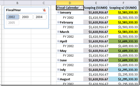
The resulting DAX output matches MDX Scope:

image

The pattern of - 

AggregateX( <granularity at which the expression executes>, <expression>)

is still being used here.  So for each cell output displayed, the calculation always executes at the monthly level of granularity even if what I am showing is quarterly or yearly data.

In order to ensure the pattern works, lets test a few more things.   First, lets add the Fiscal Year below the month:

image

We see that the new calculation (Scoping v2), is able to keep its context appropriately even in this scenario.

As a second test, lets place the Calendar Year and Calendar Quarter in the row labels instead of the Fiscal Year and Fiscal Quarter.   With the initial calculation, the current query context will dictate what will be used to compute the monthly values.  However, as the new calculation explicitly calls the Fiscal Quarter as part of the expression, the values will still be correct even in this case.  In order to make the solution easier to understand, I added an extra measures called ‘Current Fiscal Quarter’ to the model with the following definition:

Current Fiscal Quarter:=IF(HASONEVALUE(DimTime[FQ]),

                                                   VALUES(DimTime[FQ]) )

image

Now, if we place the Calendar Year and Quarters in the row labels, we get:

image

As you can see, monthly values are still evenly assigned from the Fiscal Quarter, even though the fiscal quarter is not part of the slicing hierarchy at all.

As mentioned on the prior post,  Jason and I will be using a similar pattern to tackle some interesting Last Non Empty Scenarios.  That, however, will be the subject of a future post Smile

SCOPING at different granularities in DAX (Part I)

One of the most powerful MDX functions is SCOPE.  With it, one can override cell values at any level of granularity in an SSAS cube and their new custom values will now be considered when returning aggregate results.

It is generally understood you can’t use SCOPE-type functionality in an SSAS Tabular model.  But if we examine the topic a bit closer, we realize that a lot of what is possible with SCOPE statements can also be replicated with DAX expressions.

One of these examples is the ability to manipulate the granularity at which a computation executes.   My colleague Jason Thomas ( blog | twitter ) recently posted a blog entry of a technique in which the expression scope is changed in order to iteratively prototype the correct granularity needed for a business calculation (See his blog entry here). This is the same technique can also be used to solve advanced Last Non Empty scenarios, something we will blog about soon.

Lets look at another example.  In the Adventure Works cube, there is a SCOPE statement in the MDX cube script in which months are evenly assigned the sales amount quota of their parent quarter on the fiscal year 2002:

image

In the cube designer we see that this is necessary in order to have monthly values, as the dimension usage has been defined by tying the ‘Sales Targets’ measure group with the Date dimension at the Year/Quarter level of granularity:

image

When browsing in Excel, we see the output of the behavior as:

image

We can achieve the same behavior on a tabular model by iterating through the distinct list of months in the lookup (dimension) table. To begin with, we load the appropriate tables in the tabular model:

image

Note that I created a hierarchy with custom fiscal year (FY) and fiscal quarter (FQ) calculated columns, in order to match the dimension member caption in the Adventure Works cube. When pivoting the data, without any DAX expressions defined, we get:

image

Notice the sales amount quota is tied to only one month.  This is because DimTime is at the daily level or granularity;  when Fact Sales Quota relates to DimTime, it assigns values on a specific date – however, as these quota values have been defined by the business at the quarter level, the regular sum aggregation at the monthly level does not make much sense.

SCOPE, in the MDX cube script, deals with it by getting the quarter value and dividing it in three, and assigning this new value to each of the months belonging to that quarter. To match the output of MDX SCOPE in a Tabular model, we use the following DAX expression:

Scoping (SUMX):=SUMX(
    VALUES(DimTime[EnglishMonthName]),
    CALCULATE( SUM( FactSalesQuota[SalesAmountQuota]  ) /
            CALCULATE(
                COUNTROWS( VALUES( DimTime[EnglishMonthName] ) ),
                ALL( DimTime[EnglishMonthName] ) ),
        ALL( DimTime[EnglishMonthName] ) )
)

Which yields the following output:

image

This DAX pattern involves using a row-by-row execution using SUMX over a table of distinct values at the desired level of granularity:

AggregateX ( <granularity level>, <expression> )

As you see, the pattern is just using the signature of any of the AggregateX functions.  The only difference is one of perspective:  in our case, we are explicitly leveraging the first argument to change the granularity at which the expression evaluates.  The granularity level is specified by generating a table at the appropriate level desired, whether you use VALUES, SUMMARIZE or even CALCULATETABLE.

This same technique is something Jason and I have explored when tackling interesting analytical scenarios, like the calculation of Last Ever Non Empty, which also uses the same pattern.

Clearly, the same result can be achieved by using other methods in this case.  One of those is by detecting level, as explained in more detail on prior blog entry.  If we apply that technique here, we get:

Scoping (ISFITLERED):=IF(
    ISFILTERED(DimTime[EnglishMonthName]),
        CALCULATE(
            SUM( FactSalesQuota[SalesAmountQuota] ) / 3,
            ALL(DimTime[EnglishMonthName] )
        ) ,
    IF(
        ISFILTERED(DimTime[FQ]),
            SUM( FactSalesQuota[SalesAmountQuota] ) ,
    IF(
        ISFILTERED(DimTime[FY]),
            SUM( FactSalesQuota[SalesAmountQuota] )
        )
    )
)

image

Notice how the total level is not showing a value, as I didn’t account for that level in my conditional IF statements. This is not ideal as in many scenarios you need the ability to compute on a level that is not displayed on the pivot table or report.

For example, if we wanted to slice this measure by  the Sales Territory Group dimension, we would get:

image

As you can see, when an unexpected context has been introduced, the technique using SUMX is still able to compute at other levels whereas using ISFILTERED can’t due to the unexpected filter which is not accounted for. Clearly, using ISFILTERED in this case would diminish the usability of the model.

ANATOMY OF THE CALCULATION

As we are computing rows for each member at a specific level or granularity, it is necessary to iterate through this members. The SUMX function allows us to do just that.

It is known that iterative functions like this do not perform as well as other calculations that compute on ‘bulk’ mode (like SUM).  However, SUM can only take a column for parameter, whereas with SUMX we can specify a table on which the expression will be computed on a row-by-row basis. An we need this table parameter precisely because it is the one that allows us to define the grain at which we the evaluation to be evaluated.

The calculation takes the list of distinct months and, through row context, grabs the quarter value and divides it by the count of months belonging to that quarter.  This is possible due to the fact that the context at the month level has been cleared out, and hence the values always belong to  the next level for which there is context (quarter in this case):

image

Notice also that the distinct list of months must be generated off the appropriate side of the one-to-many relationship:  if we had a column for month on the fact table and used that we would have gotten the following, obviously incorrect results:

Scoping (Incorrect Grain):=SUMX(

   VALUES(FactSalesQuota[FactMonth]),

    CALCULATE(

        SUM( FactSalesQuota[SalesAmountQuota]  ) / CALCULATE( COUNTROWS( VALUES( DimTime[EnglishMonthName] ) ), ALL( DimTime[EnglishMonthName] ) ),

        ALL( DimTime[EnglishMonthName] )

    )

)

image

Clearly, values not assigned on all qualifying months – only the ones active based on query context. As I have described on a prior blog post, DAX context does not automatically propagate from the base table to the lookup table.

We can take advantage of this by generating the distinct list of months based on the lookup table: doing so guarantees we will get a list of all months, regardless of the current filters in action on the fact (base) table.

IS THIS A REAL ASSIGNMENT OF VALUES?

It is not. In DAX, we are not really assigning or overriding values as we would with an MDX scope statement.  However, in Tabular, we have the ability to generate a new calculation that computes at a certain level of grain; this allows us to mimic the same behavior as that achieved through MDX.

The experienced MDX or DAX user may have noticed that our defined calculation expects a hierarchy in order to show the assigned values: we do this as we are clearing some filters but expecting others to be kept. When looking at the results at one level of grain only (monthly), this will lead to different results to those we get by use of the MDX SCOPE function. However, using DAX we are able to overcome this: see how on the second blog entry on this topic available here: https://javierguillen.wordpress.com/2012/05/04/scoping-at-different-granularities-part-ii/